The Great Lakes Loons unveiled their new logos and uniforms during a fan event at Dow Diamond today, revealing an updated look for the team’s 10th season.
Here are eight new Loons logos, with the primary one in the middle:
I think the new logos look sharp. Here are larger versions of a few of them:
Here is what the new home uniform looks like, featuring the word “Loons” underlined by a wing.
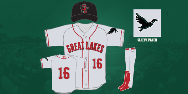
The new road uniform also is white with red socks and numbering. The cap and sleeve patch feature a more realistic-looking loon.
The Loons also unveiled an alternate uniform that combines elements of the home and road uniforms, with green as the primary color.
What do you think of the new logos and uniforms?
*All graphics courtesy of the Great Lakes Loons


